| the
knight (fluph)
Step 3a:
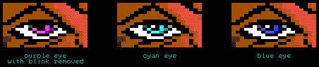
i'll start with the most obvious change, the eyes... eyes of your
character are one of its main features.. bad eyes ruin your picture
totally.. they are the essence (how subtle) of your character..
i made the eyecases (that english?) a lot bigger at first, so i would
have more space to actually put in the eyes without having to cramm all
of it into the tiny space.. don't be afraid to make them quite big.

i: just fill it with black space at first...
ii: make sort of an eliptic form in white inside the black space, leaving only a round black space empty in the middle. try not
not let the white area touch the rest of the (brown) face.
iii: now put in the eyecolor. don't forget to put in that certain "blink" into the eye. if you don't have space, start over again,
coz this is what "does it" to the eye. if you leave it out, the
eye will most probably suck bigtime.. i'll prove it to you ..
and show you some different eyecolors while i'm at it..
Step 3b:
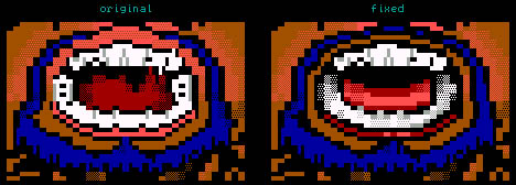
okay, onto the next change. i shaded the face darker than it originally
was, mainly due to the fact that there couldn't possibly be so much
highlight on top of the face (where the hair is implanted). this also
made it much easier for me to let the hair flow over the face.
Step 3c:
another very important thing to watch out for is that you don't let full
colored blocks of one color touch other full colored blocks. your ansi
will look much better if you leave a tiny line of black space between
different colors. i'm aware that this is not always possible, but you
should do it as much as you can. it adds to the technical level of your
ansi, aswel as to the visibility. i'll show you exactly what i mean.
in this particular case, i had no other option than to erase a lot of
pink flesh color and make it browner.. if i would have made it pink it
would seem too highlighted.
Step 3d:
also notice the different tongue i gave him.. the shading was a bit messy
in the original so i decided to make it look more solid. also the lower
teeth were changed here.. i'm still not happy with them at this stage,
but we'll deal with that later..
steps 1 & 2
[step 3]
steps 4 & 5

|