|
Fluid
#2 - score: 6 out of 10
Mongi:
The first Fluid pack was never reviewed due to lack of time,
not enough material to review, and most of it were released
in Purg already. The second pack is totally different in
both quality and quantity, and they have a very enthusiastic
leader (judging from the infofile).
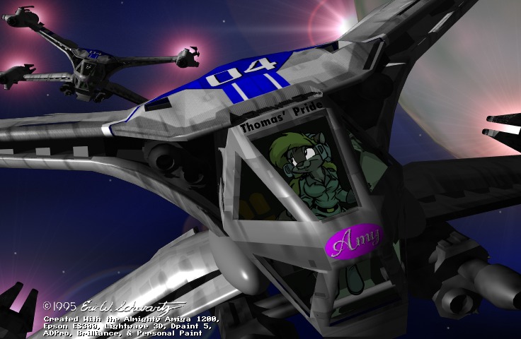
Alan Mackey and Eric Schwartz(?)
have very similar styles. Both are drawing toon cats and
foxes. While Mackey have a very classical toonshading, Schwartz
is using more traditional shading, thus giving his pics
more depth. In additional to the good shading, he blends
in rendered parts pretty seamlessly. The fact that Scwartz
have made all his art on Amigas is fun, considering this
is the PC scene. There isn't much to comment else than these
are good toons, quite different from artscene art.
Pike (CiA) makes an appearance
with one of his vigorous chicks. Apparently it's a Gen13
chick, but she's put on some weight. The background is nicely
done, trying to get the feel of a waterfall, it mostly looks
like strange noise. The water could have been done more
realistic by marking the water going around her legs with
waves.
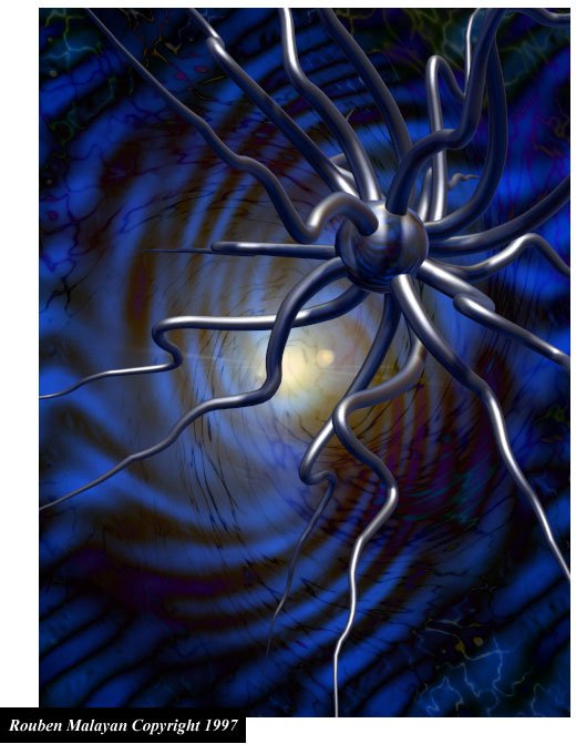
Ruben Malayan's abstract rendered
pieces are very fascinating. Completely non-figurative pieces
tend to be done with tools generating nonsense until it
looks somewhat good. But Malayan's pieces seem to have created
with an intention he already had, having full control of
it. They give a feeling of being harmonic, rather than total
chaos.
Compared to the rest of the
pack I can't understand how Steroid's pics passed QC. Having
no design whatsoever (or the worst I've ever seen) it's
clearly newbie work. I wonder if he's drawn anything at
all, or if it's all filters.
The rest of the pack was of
average quality. Starks's work bothers me, though. I have
a very strong feeling they are ripped. Suppose he have made
the pics: why embossing(?) it? Why invert the colors on
the winged guy? Firstly, the dragon looks screened/pixilated
just as if you have scanned printed work. Secondly, both
the dragon and the mouth in the corner are already released
in the last Purg pack, only the dragon had inverted colors
and the mouth was bigger and had more details. Why ruin
a painting like that? I don't have any proof, so I'm not
saying Starks is ripping, I just feel that way. If Starks
really haven't ripped, I apologize.
It struck me that most pics
are dated 1997, and some even back to 1995. Like Moonrise,
I'm asking the question again whether the artists really
are dedicated to the group? No pic in the pack says Fluid
anywhere. And the pics are old. Draw your own conclusions.
score: 6

|